
Return Consulting GmbH
Brand identity / Tone of voice / Art direction
Return consulting is everything but an ordinary digital consulting agency from Frankfurt. Their philosophy is pretty unique – in everything they do, they look for more answers, far beyond the regular way of thinking. Their approach is a merge of analytics and creativity. Return is a confident and dedicated partner in projects, that always go one step further, in every aspect.
But, there was a problem...
The way they see and perceive themselves was not visible in their communication and identity. So, our mission was to create a proper brand. The brand that will clearly communicate the values and vision of the company. The brand with attitude.
The Solution
In order to find the best possible solution, we really had to think big. And during that process, it all clicked – it’s not enough to think big, we have to go even beyond that and think bigger.
Just like return does in every project.

Design System


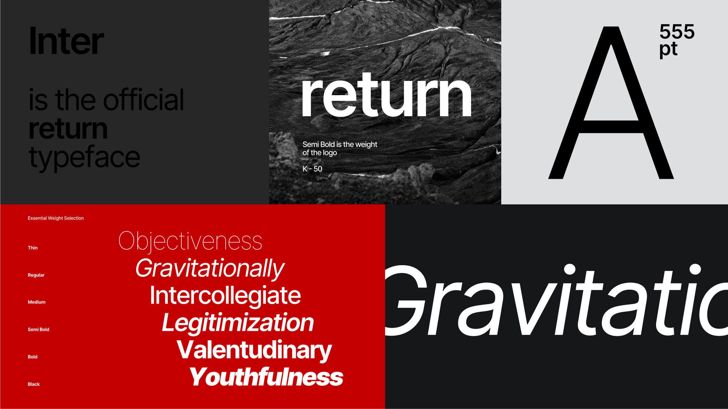

Communication and visuals


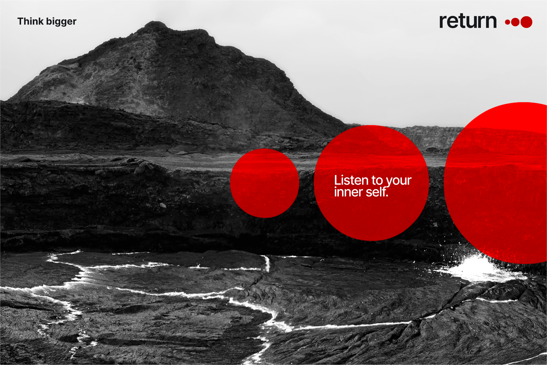


Photography Direction
We decided to avoid generic color stock photography, since the use of stocks is a highly frequent and necessary tool for rationalizing Returns tasks and communication. The black & chrome theme gives the the user more agility in wide usage and is less restrictive than color photography in presentations and concepts.
Most importantly, this style provides an essential dramatic brand look across all channels.


Credits:
Creative & Art Direction: Ognjen Enakinski
Communication & Strategy: Marko Jovanović Ptica
Animation: Boris Gvozden
Client website: